Industrations is a freelance illustrator focused on bookcovers and fanart. Industrations stands out by using whimsical fantasy elements in their artwork. To take the next step in their career they needed an official logo and website where commissions can be placed and their portfolio could be shown. The website and logo needed to be as whimsical as their artwork so that their current fanbase would recognize them and feel at home
Contributions: Logo design, branding elements, website design and website build in square space
Owner: Industrations

Industration's corporate identity should primarily reflect the personality of the artist and the illustrations they convey effectively. To get an idea, I asked for a number of personal traits they wanted to incorporate into the style. These were primarily:
- The feeling of autumn and autumn colors
- Fantasy elements and feelings, such as the forest, magic, witchcraft, etc.
- Incorporating the persona of the illustrations, which utilizes a garment in the shape of a moth.
With these elements in mind, I started on a number of sketches for the Industries logo. I really wanted to incorporate all these personal elements into their logo.


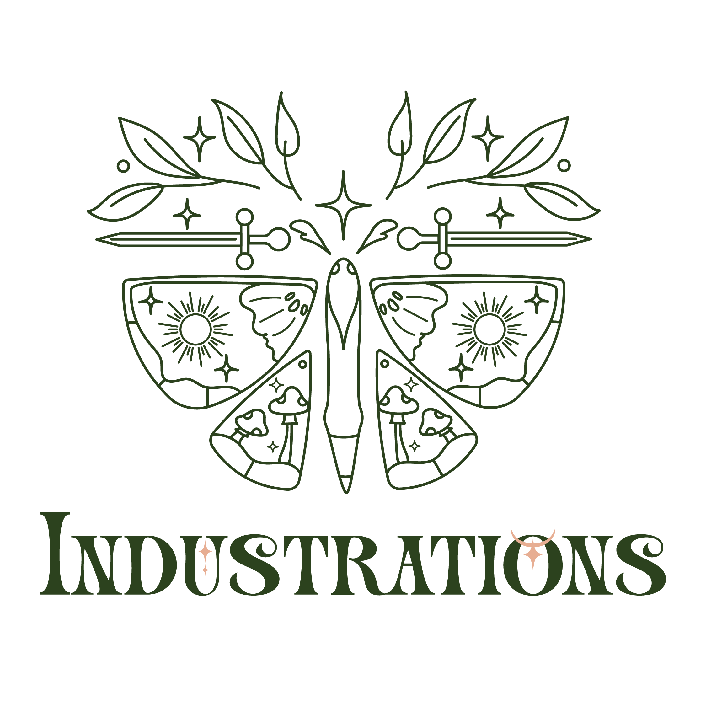
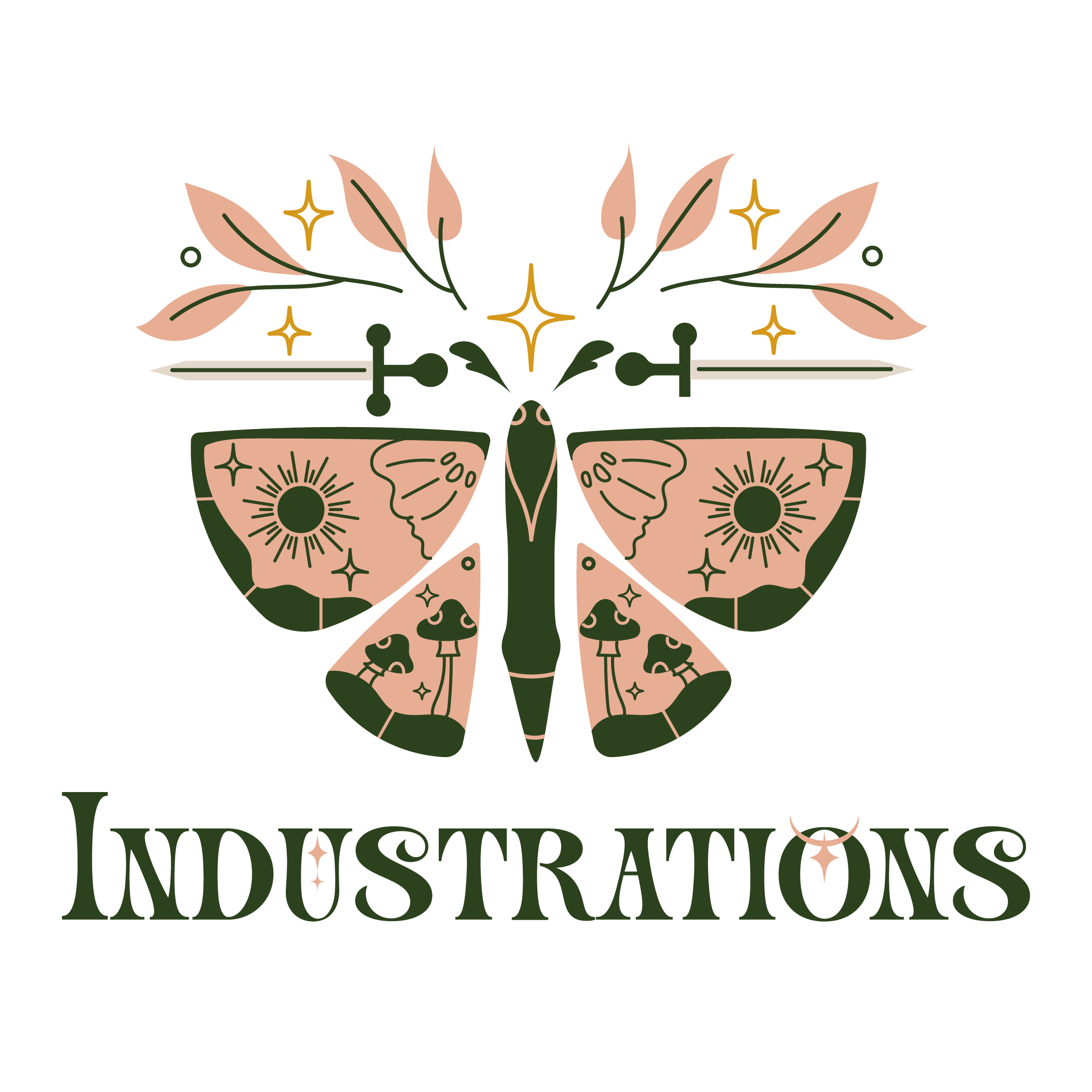
After looking at different shapes, elements to incorporate and fonts that convey the whimsical and fantasy like vibe of Industrations, we looked at the different sketches and made a decision to continue building on one. The wings of the moth use fantasy like elements that represent the artist. The font used adds a fantasy like feeling to the logo whilst still readable
The chosen sketch was made digital. I tried out different styles of logo's to see which one fit best with Industrations wishes. It came to a balance of modern and detailled, so that the logo would still be recognizable on smaller sizes but kept the whimsical feeling of Industrations. By balancing the logo symmetrically, the logo can be use in different shapes and sizes and is adjustable for print and web.
Logo option: lineart
Logo option: colored
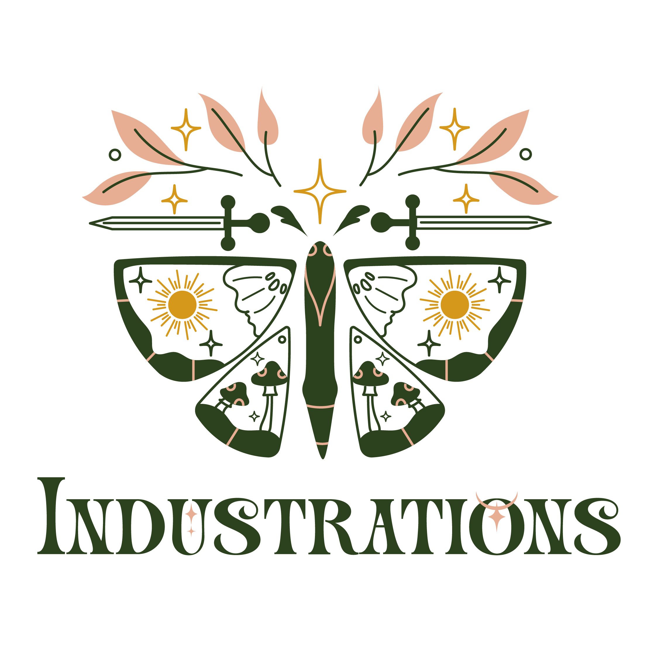
Logo option: mix of color and lines
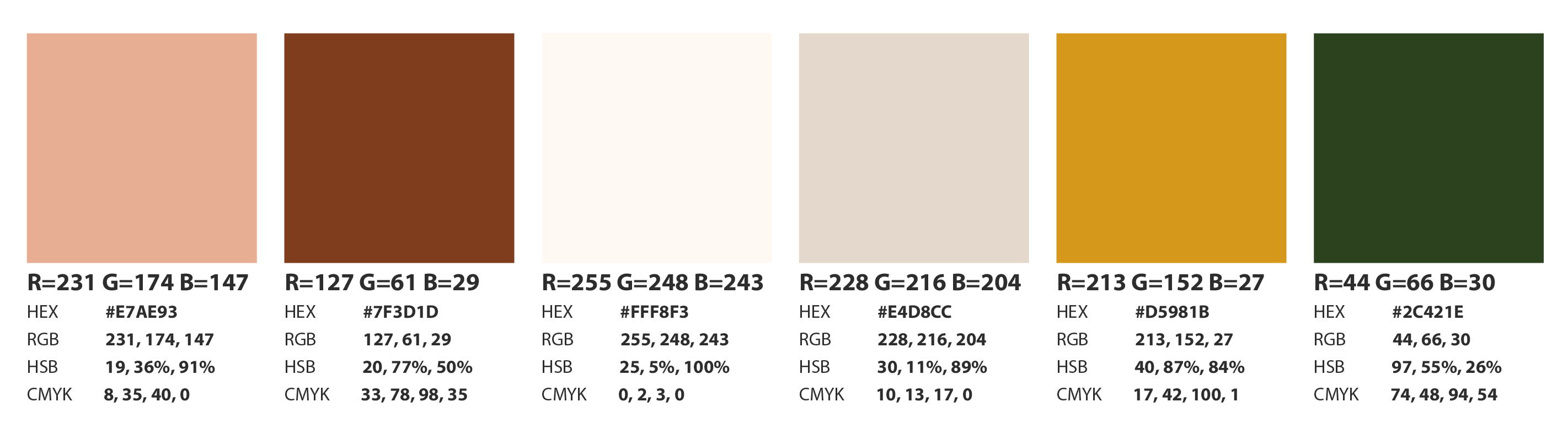
The chosen pallet has been set up together with Industrations. They preferred a combination of green and pink colors. I have added some fitting autumn colors that fit with the chosen green and pink. The colors shall be used using the 60/30/10 rule
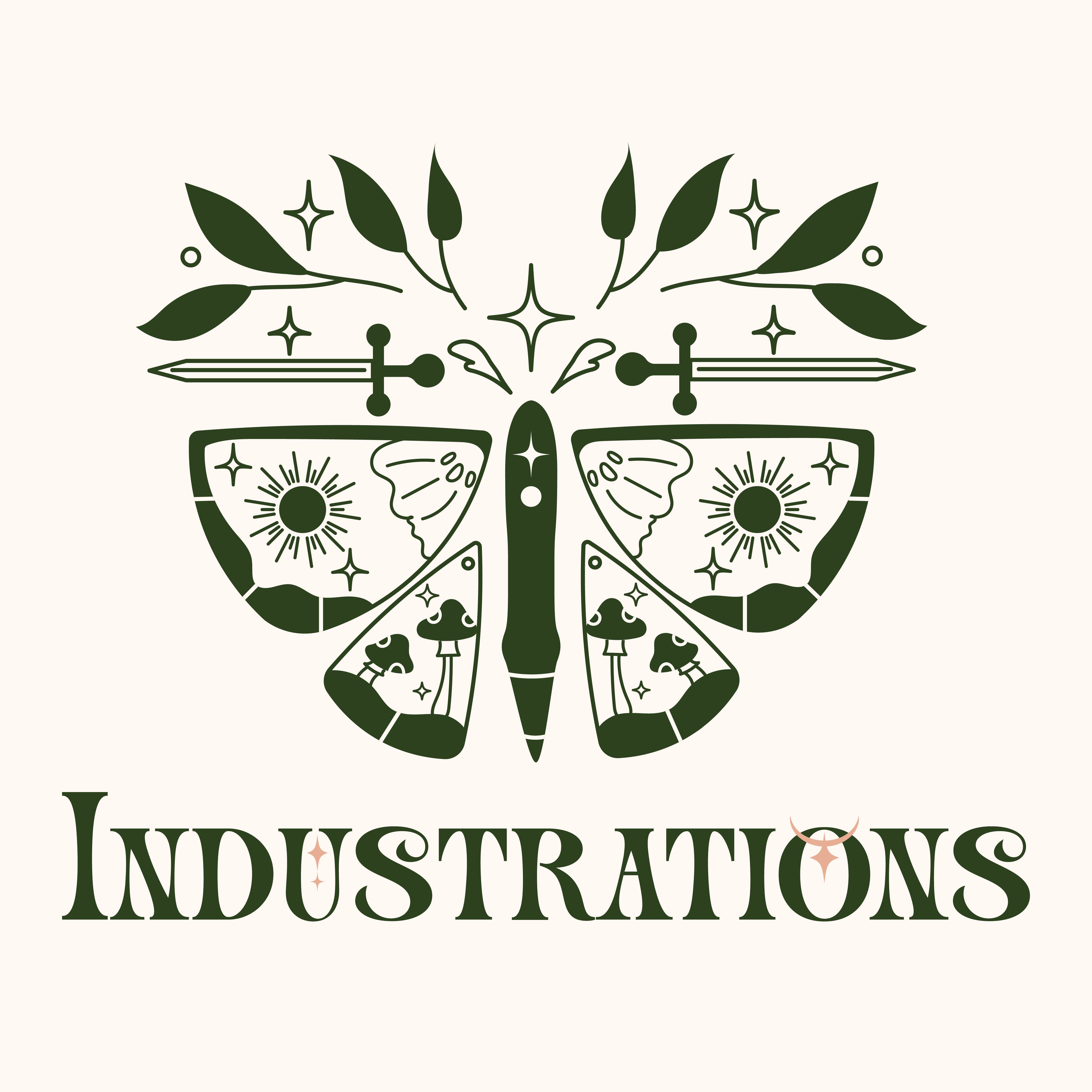
The final logo uses subtle lineart in combination with filled elements to make the logo stand out from the background. The Icon can be used on its own or in combination with the letters. The logo can be used in light and dark mode by using the chosen color pallette properly.
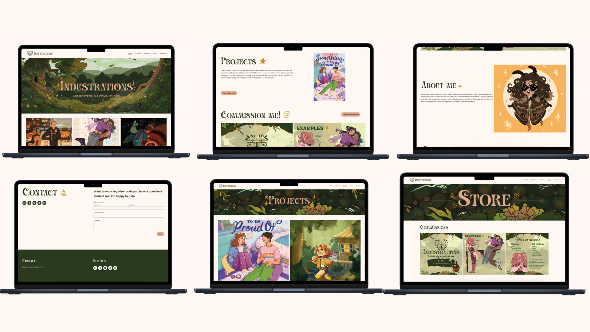
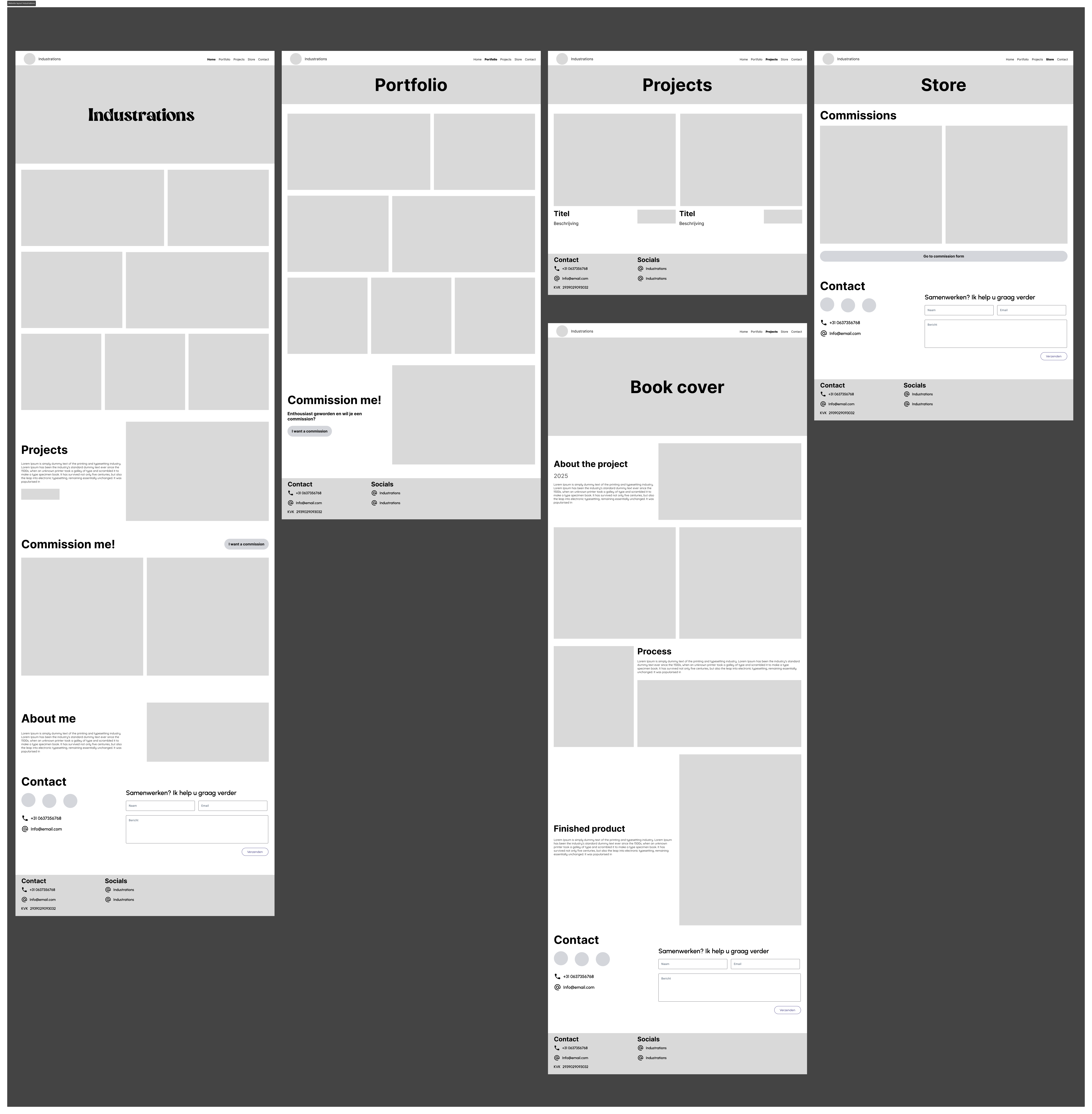
For the website design, the portfolio aspect and the sale of products were considered. It was decided to build the website in Squarespace, as this provider offers many e-commerce features that can be used for selling commissions or products. The website layout uses various sections for different elements and employs a simple, modern layout to ensure easy navigation. Industrations' art is showcased on the banners. Many images are displayed on the site to show future clients the work. The website wireframes were approved by Industrations in consultation. By adding color and fonts, the feel of the website becomes clear.
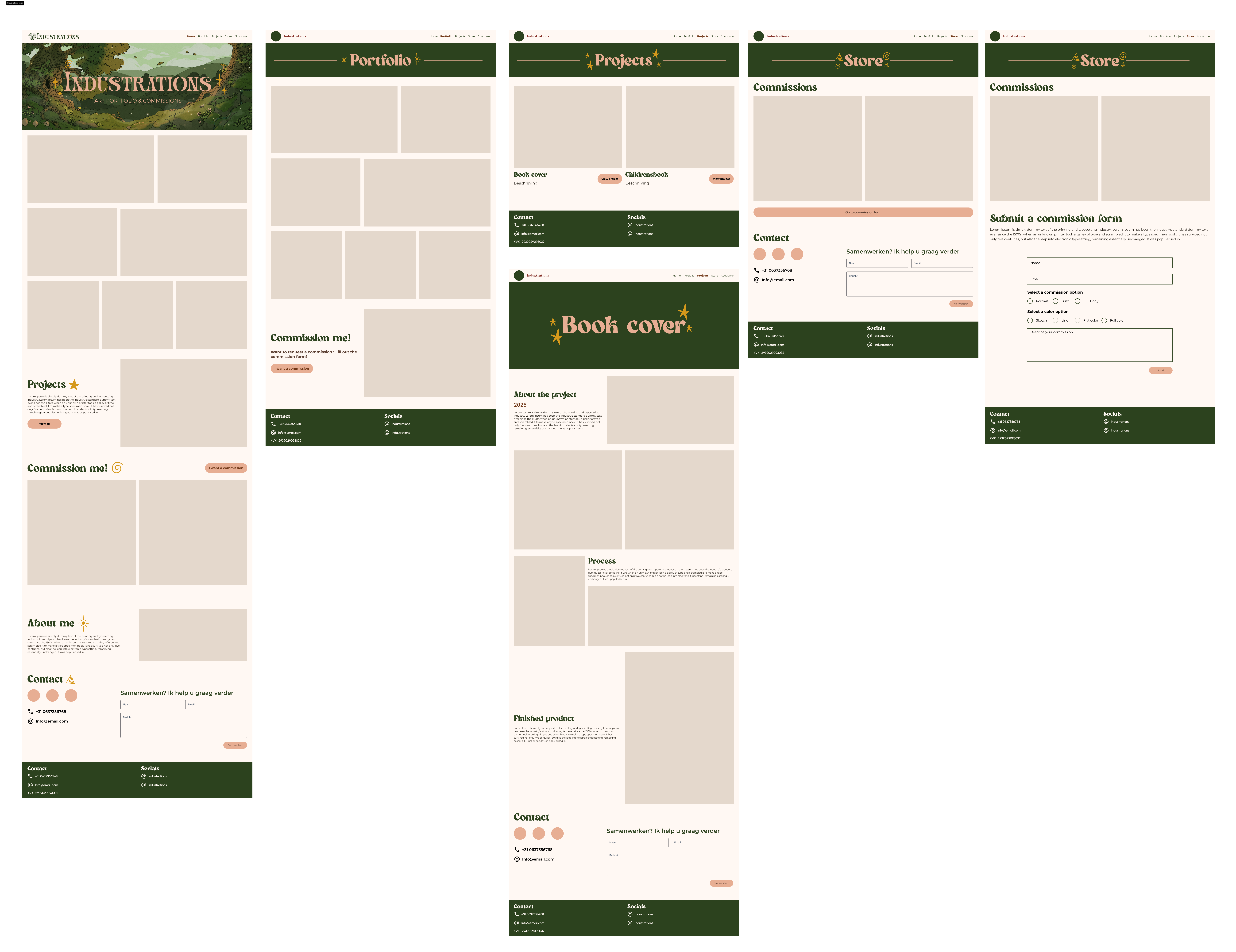
With the addition of illustrations by Industrations to the banners and content, the feel of their branding truly comes to life. By consistently using forest green in the banners, the website becomes a cohesive whole, yet each page still feels unique due to the different icons accompanying the titles. All pages are accessible via the homepage, allowing people to navigate easily.